Making the Grade
Subtle changes to the contrast
Intorduction
When I started the photographic journey of discovery all those years ago, we were taught to look at our negatives and make some observations about the image we were about to print. The purpose was to determine how to get the actual results you wanted without wasting dozens of prints to achieve the result. This process was in effect a grading exercise, where the actual tonal range of the negative was used to determine the paper used to print the image. This was because at school we had to use single grade paper. We used to get really annoyed at this, for there was multigrade paper, but Mr Jenkins would insist on us doing it the hard way. It reality, we learnt a very valuable lesson and I am pleased we went on that particular journey of discovery.
So, what is Paper Grades? Simply put, there are 6 paper grades being 0 to 5, or should I say there were 6 grades, but more on that later. The difference is the way the paper handles tonal range. Grade 0 is very low contrast, were there are 50 shades of grey and definitely no fun, through to Grade 5, where you could be mistaken in thinking that you were living Batman’s mantra, as in “I work in black or sometimes very, very dark grey.” It was with me for I was still at school and it had to be grade 5, or at a pinch, grade 4 as the paper of choice.
So, to allow you to see the effect grades have on an image, I have printed a relatively flat image. Though Thor the cat is creamy white, the image was taken on a very dull day in the shadow of my house. Looking at the negative, it is clear that there is detail in the shadows, so I would want to bring some of those details out while having Thor emerge from the background.
Grade 2
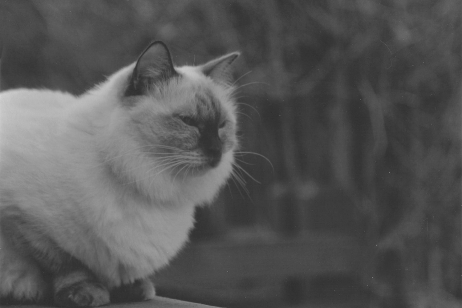
Thor in Grade 2
Starting at the grade 2 image, Thor is not really popping out of the photo, but we do have a full range of tones. In the background above his ears, there are nice transitions from light to dark. This is where the lower grade paper shines. It allows for smooth transitions from shadows to highlights.
As a side note, grade 2 is the place to start when printing a negative. While you might want high contrast and no mid-tones, but the grade 2 print will show the image with a good tonal range. In effect it is the best place to start when printing a negative.
Grade 3
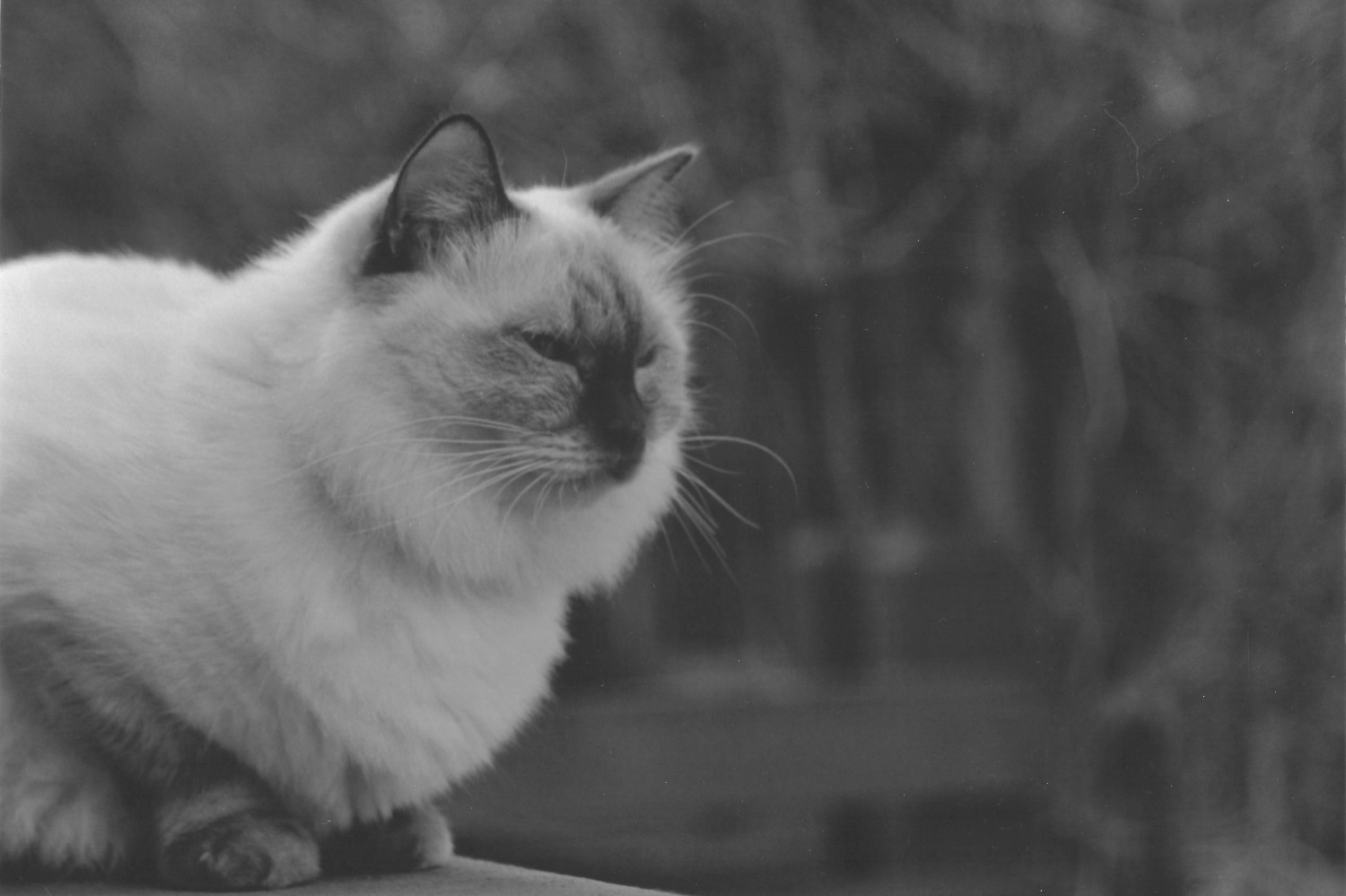
Thor with a bit more contrast, Grade 3
The grade 3 is not a major step in terms of grade, but it shows the nature of a higher grade on the transition areas. If you look at the background above Thor, there is sharper change from highlight to shadow. As the image is now a lot better, I decided grade 3 was the way to go. Higher grades will begin to loose too much of the details, though they will look much sharper.
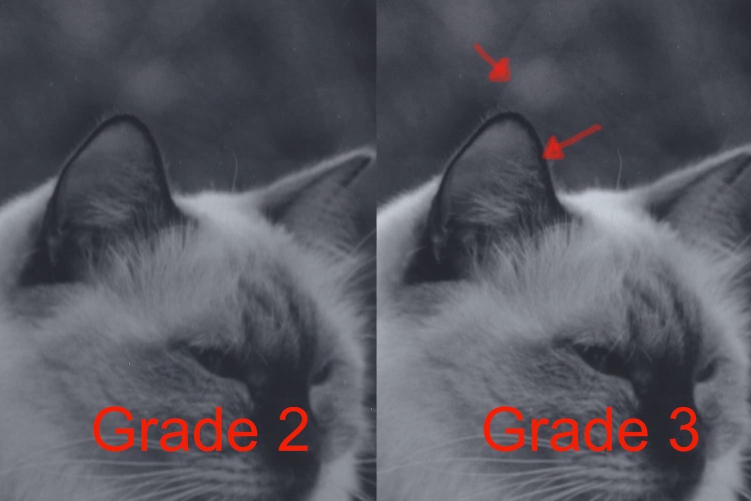
A closer look
A close up of the different grades
In the side by side example, I have placed arrows on the subtle changes that a different grade produces. The top arrow shows where grade 2 shines, in allowing a larger range of tones to show through. In the grade 3 example there is a clear delineation between the dark areas and lighter areas. The second arrow, where the edge of Thor’s ear shows deeper blacks and looks sharper, another hallmark of higher grades. Just think how much you pay for that Photoshop subscription for something you get for free by simply printing on a higher grade paper?
So, as a final observation, it can be tempting to always use a higher grade paper to achieve a sharpness, after all there are no sharpness sliders in the darkroom. Although I like a degree of sharpness in my images, I have learnt that a lower grade paper can work to bring out an overall effect that needs a full range of tones. Sometimes it is better to try a different grade that seems initially counterintuitive, as the image will come out differently and you can be surprised by the results.
More higher grades
Higher Grades
Making the grade


Also, I discussed being stuck with single grade paper when I printed at school. At the time, I know we could grab the box of grade 1 to grade 5 paper, and we could get grade 0 if we had a particularly dense negative. These days, printing on single grade paper is less common. Foma still does a range of single grade papers, being Soft, Special, Normal and Hard. Ilford only has grade 2 and 3 on offer. While most people won’t want to go back to using single grade paper, it adds to the discipline exposing and developing your film. In fact, I wonder if single paper was all that was available how it may reduce the trend of pushing film three stops or more in what is a pissing up the wall competition for exponents in those dark arts?
As we have seen the digitalisation of negative printing, the market for single grade paper has all but disappeared. Instead we have the joy that is multigrade paper to save us. This is an advantage, as one pack can be printed at different grades as required. It does not stop us having to evaluate the negative to determine the best grade to print a photo at, but it allows for a lot more control through the use of Multigrade filters or by a colour head on your enlarger, getting the exact grade needed to get the best out the negative.