Plesure and Sadness
A STREET PHOTO ON FILM

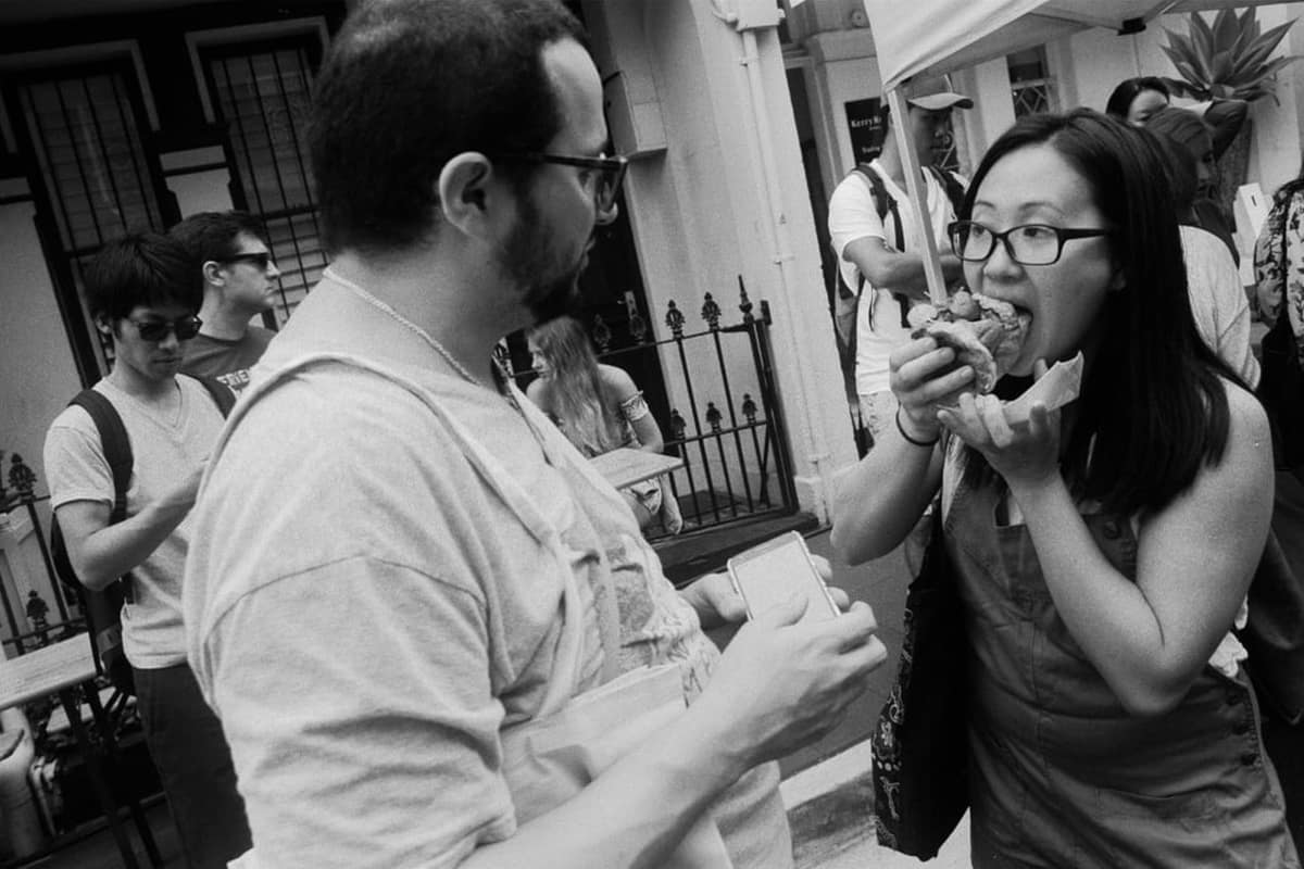
Pleasure and Sadness Final Image
Introduction
When photographing the street, I look for photos that are of ordinary, everyday things. I love the genre, as it is a genuine record of how we live life. So when the William Street Festival occurred in late October 2018, I was there with my Olympus OM-1 with a 28mm lens.
My approach
So, how do I approach these events? Well, firstly I determine when the event will occur and what will be the best film to suit all the lighting conditions I may encounter. Most of the time, if you are going to have varied shooting conditions, I would recommend Ilford Delta or Kodak Tri X. I have a preference for Delta, for I love the tones and feel of the film, but Tri X is also a great film for street photography.
Once you have selected your film, the next thing is to understand the type of photos you will be doing. As a rule, if you are wanting to get individual street portraits, the 50mm or equivalent is an ideal choice. If it is going to be crowded and you need to work close, then a wide angle lens is the only choice to allow the full scene to be captured.
Finally, exposure is an important consideration. I suggest that you get your head around the Sunny 16 rule, as it is the basis of fast, quick exposure adjustments. If you are unsure, the other technique is to take an exposure reading for the brightest area and for the darkest area, and this gives you a range that you memorised. Another thing to consider is the reverse Sunny 16 approach, where you set your aperture to F16 and adjust the speed. You do this when doing hyperfocal focus technique. (See YouTube for: Sunny 16 Rule and Hyperfocal Distance.)
Ok, lots of things to remember, but by thinking about them, they will become second nature to you.
Getting the photo
While wandering around the William Street Festival, which was very packed, I came across a couple where the woman was eating a burger, and her partner watching her. I quickly set up the shot, but given the closeness of the subjects, I had to angle the camera a bit to make sure I had the shot I wanted.
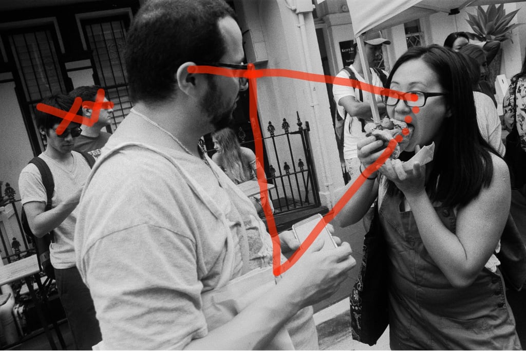
If you look at my marked-up image, which I do to see if I should crop or not, I have marked out the area of interest, the view path and other scribbles. I don’t do it on all my photos, but I do it on ones that could be improved, even if I decide a crop is not what is needed.
Marked Up Image

So, looking at why the image was not straightened, there is a clear line between the guy and the woman, and another line between the burger and his forearm. These allow our eyes to travel the These lines are so strong, the people behind are unable to distract us from the main players, which is the intent of the photo, in showing the woman’s pleasure in eating the burger and the assumed sadness that the guy is not eating a burger.
So, in conclusion, I wanted a story in one image. The photo meets that need and allows us to feel some empathy towards the man in not having the burger. It as if she is having her cake and eating it too, and letting him know it. We see him studying her, as if planning his snatch of the burger and we could almost forgive him if he did.
Please let me know your thoughts, please use the Contact link in the menu to send an Email.